Packaging
A selection of my
packaging design work
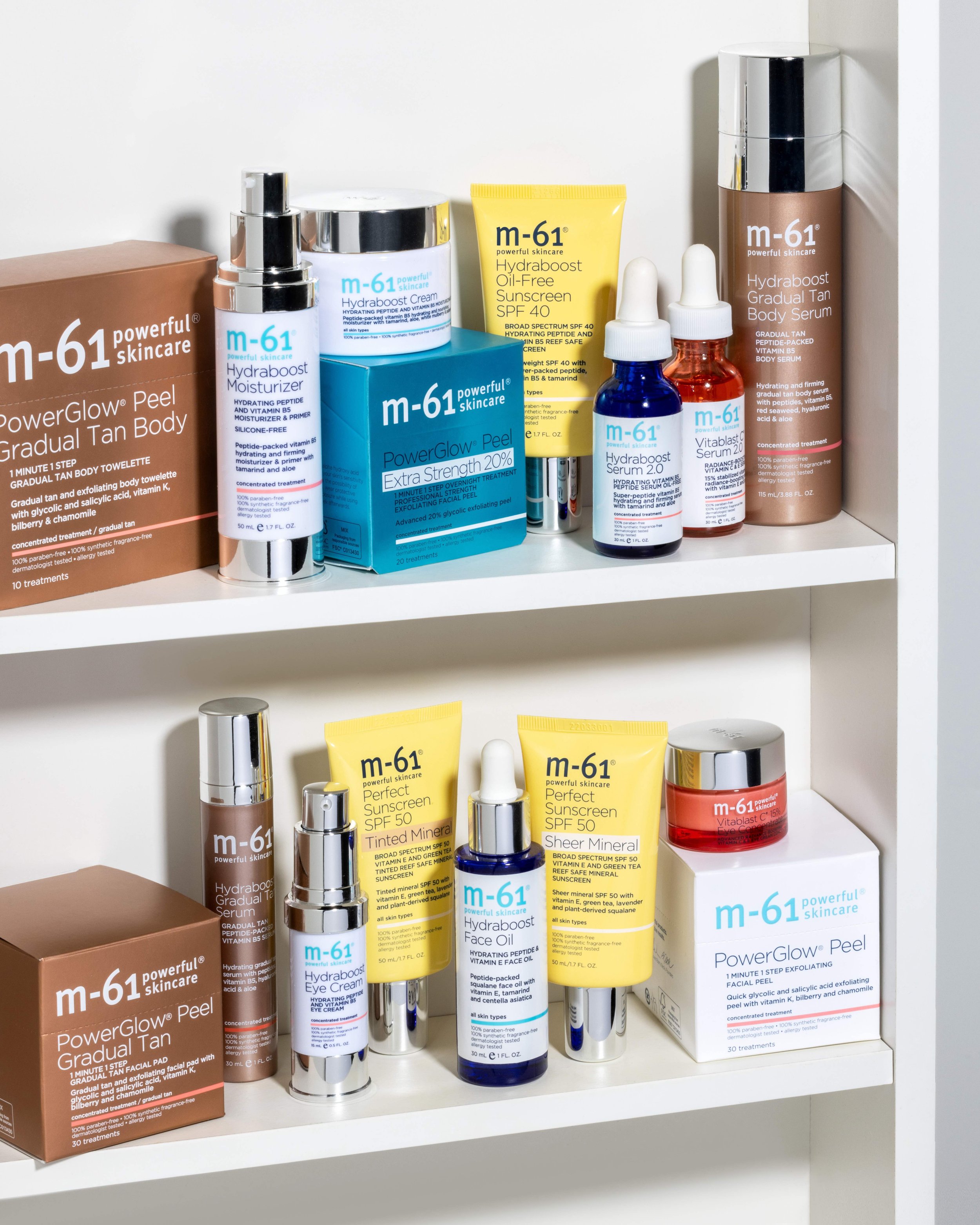
M-61 is a clinical skincare brand. With approximately 65 products and multiple sublines, design system rigor is paramount. As the Proprietary Brands Designer, I oversaw the first design system implementation, meant to ensure consistency across a variety of packaging dielines.
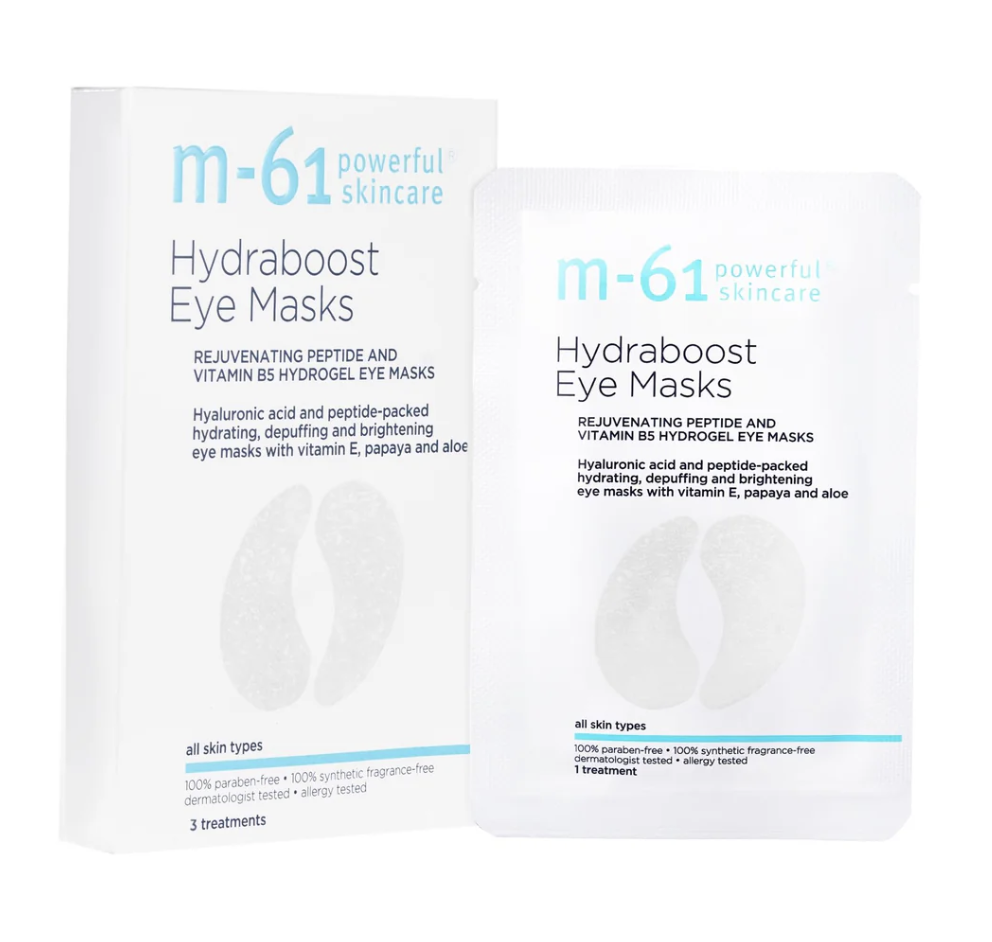
Clean layouts and clinical copy, M-61 uses color denote category.
View More Product Here
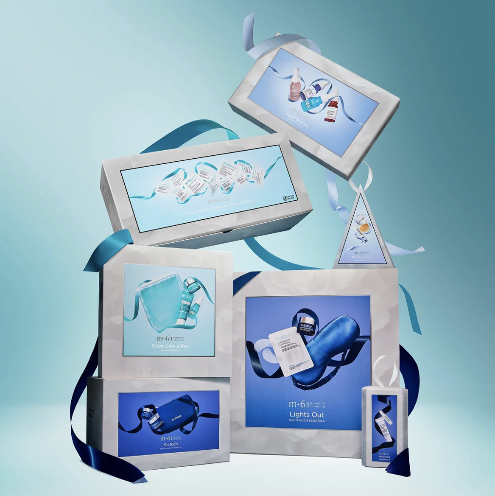
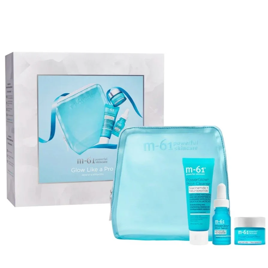
Limited-edition sets that stay true to the evergreen brand identity while utilizing special finishes and layouts to denote exclusivity.
Limited-edition holiday packaging that nods to the evergreen brand identity while departing in layout, imagery and color for a giftable holiday package.
Programs: Adobe Creative Suite – Illustrator
Lune+Aster is a skincare-forward makeup brand. To ensure consistency, I developed a design system that can flex across the variety of component and carton shapes and sizes.
Brand-forward layouts with category call-outs to help customers understand where the products fit in their everyday makeup routine.
View More Product Here
Limited-edition holiday packaging that nods to the evergreen brand identity while departing in layout, imagery and color for a giftable holiday package.
Programs: Adobe Creative Suite – Illustrator


