Print | Digital | Packaging | Art Direction
A selection of my
Beauty Industry design work
The majority of my Beauty Industry work has been on the Bluemercury Creative Team. My role straddled 2 verticals–Marketing design and Proprietary Brands design.
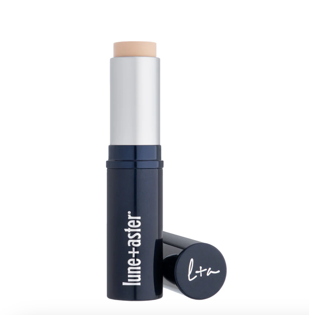
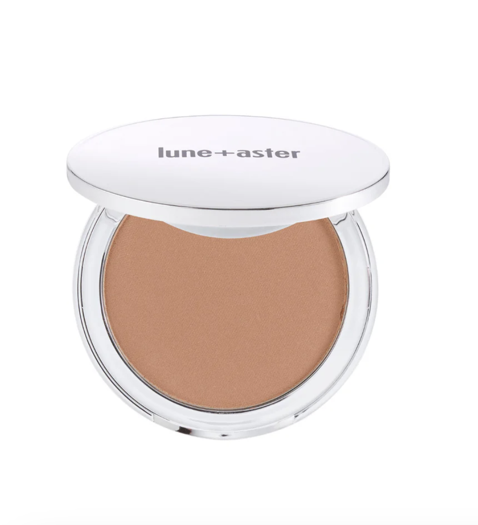
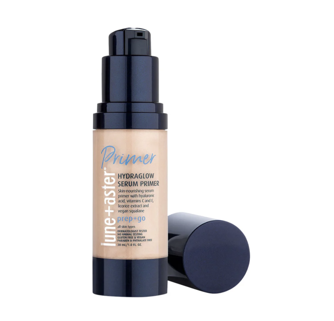
Bluemercury has 2 proprietary brands, M-61 skincare and Lune+Aster makeup. I was the lead Designer on both brands, overseeing art direction, packaging design, visual identity development and executing digital and print marketing assets.
In addition to my design work, I spearheaded competitor and trend research, built a packaging layout system to ensure visual consistency and advised on new component development.
Packaging
Both M-61 and Lune+Aster packaging design systems had to work with a range of component and carton sizes and shapes.
Original systems were in place when I started at Bluemercury, but I took on the challenge of creating a system of standardization to ensure visual consistency across all products.



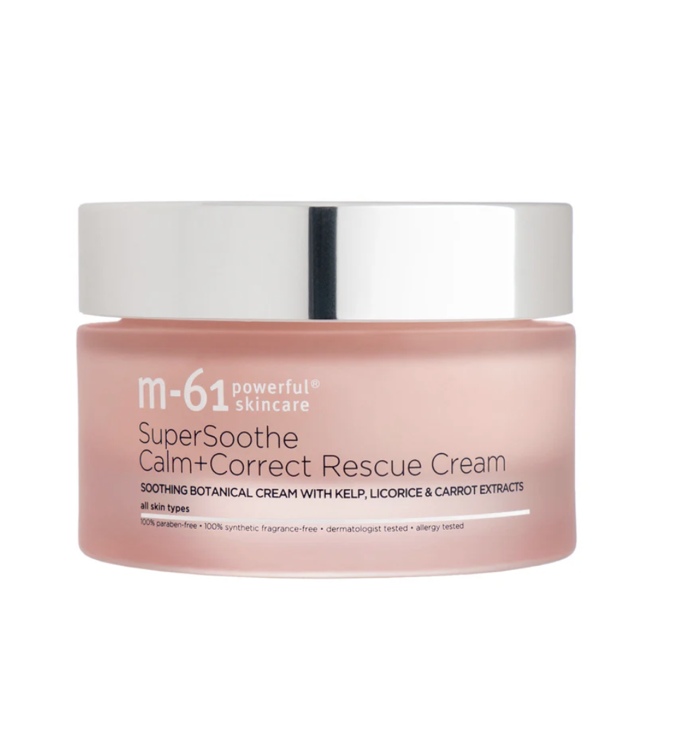







Project Spotlight
Cluttered
Clean
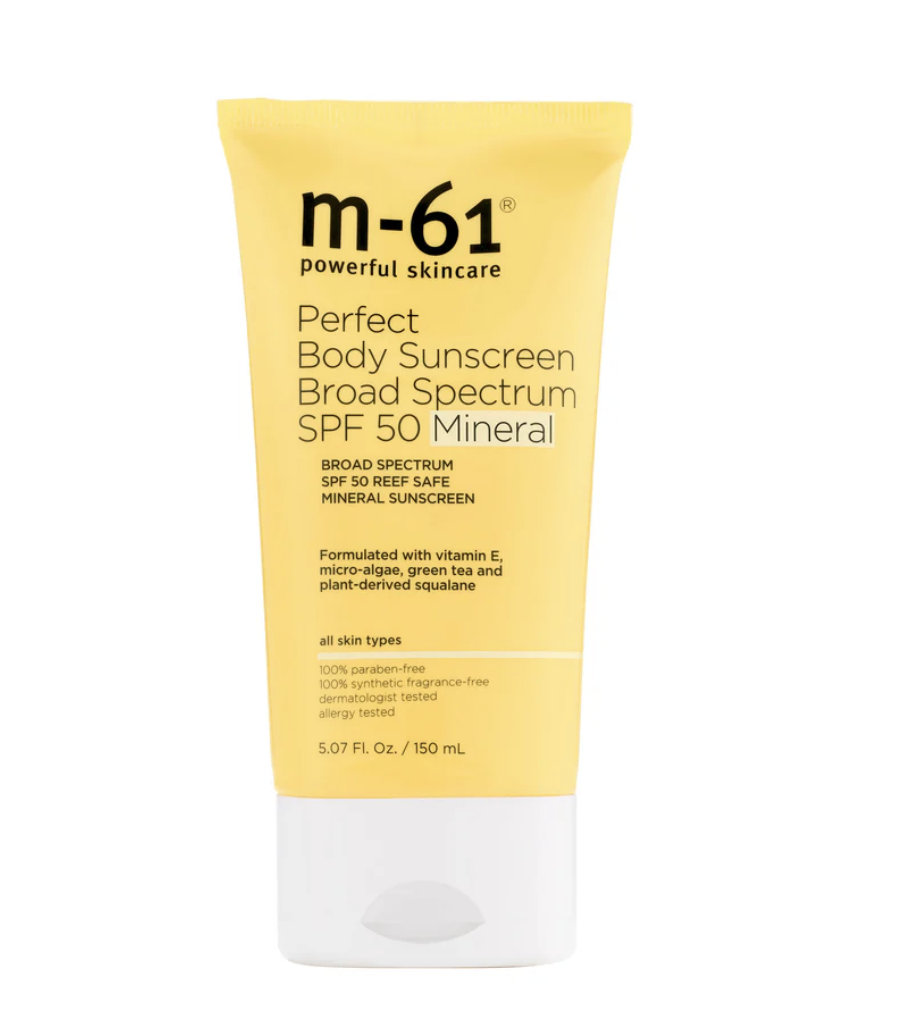
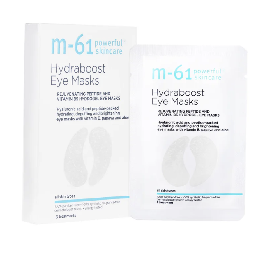
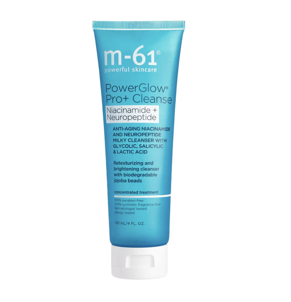
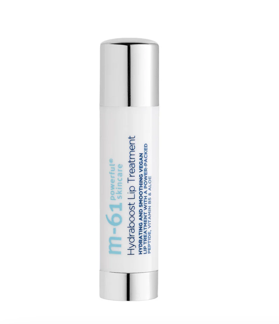
M-61’s packaging design did not aligned its brand tagline: “Clean. Clinical. Powerful.”
A deluge of information, often repetitive was crammed onto the component, and repeated word for word on the carton. My mandate was to refine and elevate the packaging design by leaning into a clean, clinical aesthetic. With our customers in mind, I advocated for a reduction of duplicative copy and unnecessary iconography, and worked with copywriters and product developers to make sure crisp, clinical language was prioritized. Our end goal was a more aesthetically pleasing product, but most importantly a product that clearly communicated its value to the customer.
From cluttered to cleaN
Marketing
I designed both print and digital marketing content for Bluemercury. The proprietary brands were treated as a vendor underneath the Bluemercury brand umbrella, similar to other brands sold by the company.
Below is an example of the suite of marketing assets we would design for a brand launch.
Instagram Post
Instagram Stories
View Individual Slides
Email
View Entire Design
In-Store Signage
Lanyard for associates
Art Direction
Both M-61 and Lune+Aster’s art direction needed a refresh.
M-61 needed it’s visual identity tightened and refined to be more recognizable. Lune+Aster needed its product shots formulation tweaked to perform better on social media. My mandate was to analyze high performing content via internal data and external insights and then incorporate those findings into my art direction.


